The 7 QC Tools
Kaoru Ishikawa a professor of engineering at Tokyo University first gives the “7 QC Tools” to world. He is knows as father of “Quality Circle”.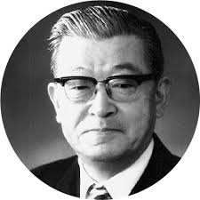 Kaoru Ishikawa
The 7 QC tools developed / originated in japan and also called as seven basics tools.
These 7 tools comprise of graphical presentation such as histogram and statistical techniques like controls charts. The combination of 7 tools useful in solving the quality, production and process related problems.
The 7 QC tools are:
Kaoru Ishikawa
The 7 QC tools developed / originated in japan and also called as seven basics tools.
These 7 tools comprise of graphical presentation such as histogram and statistical techniques like controls charts. The combination of 7 tools useful in solving the quality, production and process related problems.
The 7 QC tools are:
- Check sheet.
- Flow chart
- Cause and effect diagrams.
- Pareto analysis.
- Histograms
- Scatter charts.
- Process control charts.
- This is very basic sheet which after collecting the data shows at what interval data occurs repeatedly.
- This gives the basic idea about in what fashion the data we have to collect or how we want to proceed
- This Flow Chart is helpful in DMAIC approach of 6 sigma.
- Some of the 7 QC tools replaces flow chart with “stratification” or “run chart”.
- The cause and effect diagram introduced by Kaoru Ishikawa.
- The cause and effect diagram tell us the causes and effects.
- This has to be made by taking help of BRAINSTORMING Session.
- This has been introduced by vilfredo Pareto.
- This is based on 80:20 law.
- 80% of problem caused by 20% of few major factors which are called as Vital Few, whereas remaining 20% of problem is caused by 80% of many minor factors which are also referred as Trivial Many.
- This gives us the idea about the major problems.
- Histogram introduced by Karl Pearson.
- Histogram is a bar graph which represent frequency
- Histogram shows the variation in the data in graphical form.
- We can assess how the variation looks like.
- Scatter Diagram shows the relationships between factors which are taken for evaluation.
- The graph plotted considering dependent variables on Y – Axis and Independent Variable on X – axis
- The relationship between X and Y can be linear, curvilinear, exponential, logarithmic, quadratic, polynomial
- This gives the idea about the variation and tell which variations to control and how?
- In control chart There is central line which is average and above central line. There is line called upper control limit and line below central line is lower control line.

No Comments
No comments yet.
RSS feed for comments on this post. TrackBack URI
Leave a comment